
Research, Customer Interviews, Usability testing, Cross-team brainstorming, Wireframes, Prototyping, UI/UX Design, Animation
T-Mobile UX Team
2016 - 2018
Intro
As Senior Designer and UX Lead, I helped transform the T-Mobile billing experience for the MyTmobile.com and T-mobile app to help customers better understand their bill and reduce calls to customer care. T-Mobile is the second-largest wireless carrier in the United States, with 108.7 million subscribers as of the end of Q4 2021.
“What bill? I owe T-Mobile $70 every month, I never look at my bill. One time I had an issue and the charges were confusing and seemed to vary from month to month. It feels like you're ripping me off.”
- TESTING PARTICIPANT


Understanding my bill
When it comes to cellar plans with multiple plans, phone trade-ins, and extra services a family's T-Mobile bill can be difficult to understand. The new billing UX needed to have clarity, speed, and accuracy. Over 20 million calls annually are related to the bill, which is often our only direct communication with customers. Customers are confused by the presentation, terminology, and content — both missing and extra. Our call to action was clear, helped customers understand the details of their bill, helped predict future charges, and reduced calls to customer care.

,
When paying your mobile phone bill it was difficult to understand the breakdown of your charges, hidden fees, and if you were paying more or less than last month. We wanted customers to understand their bill better, build trust with them, and reduce calls to customer care,build trust with them, and reduce calls to customer care which cost the company nearly $160m annually.
Research
We recruited 12 current T-Mobile customers and had our participants walk through the process of viewing and paying their bill, asking for their opinion on their experience along the way.
We concluded the study by uncovering five main user pain points:
- Do the math for customers
- Highlight month-to-month changes
- Clearly, differentiate recurring charges from extra and usage-based charges
- Use common language
- Anticipate and answer questions to avoid a call to customer care
Ideation
At this point I gathered stakeholders from the team and did a card sorting exercise with post it notes. I wrote down topics of the bill, and told the users to form piles of topics that go together and then to come up with a name for those piles. Early on, it was pretty clear that many of a my stakeholders were actually aligned on the information architecture of this feature (even if they didn't know it). This exercise actually saved me a ton of time on getting stakeholders to focus on IA rather than the specifics on the mocks.
The results pointed to these main pages:
- Billing home - to give a snap shot of a customers bill
- Plans - to include line charges, add on's, plan changes
- Equipment - balances on devices, promo credits, previous phones paid off
- Features - to show add-ons, and international charges

Wireframes
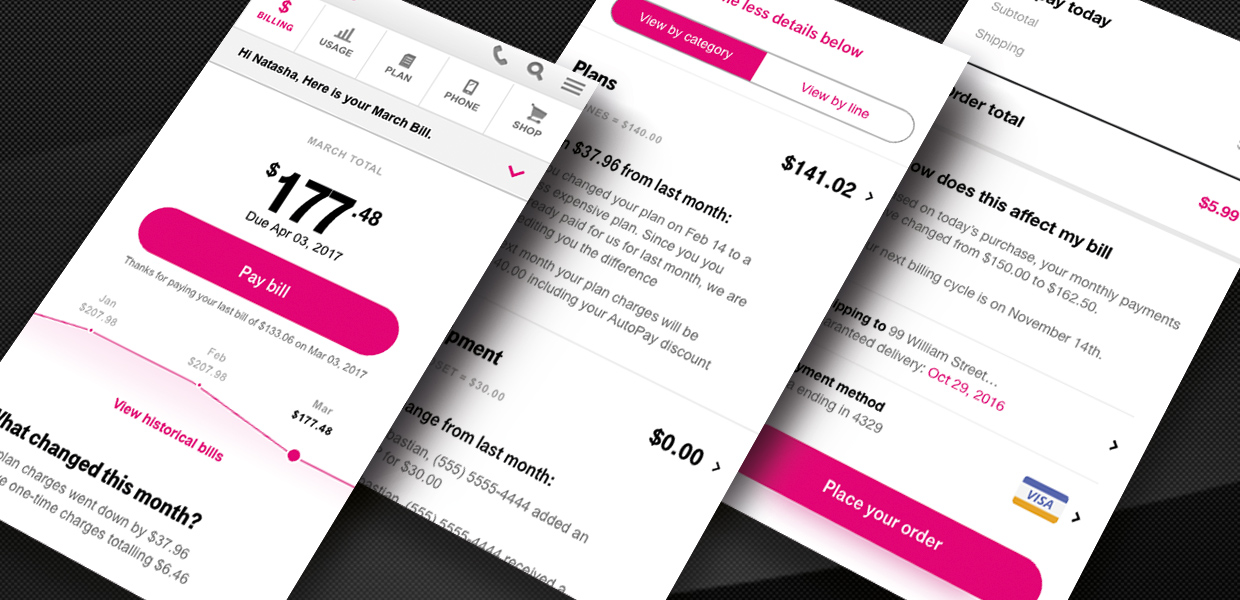
The bill was broken down into categories to help comprehension namely: Balance, Plans, Equipment, Services, and One-time charges.
One-time charges were added as a new section because of earlier research showed it was pain point with customers. We also felt it was important to view these categories first because it provides the easiest snapshot of your account to understand.

User research also showed that viewing charges by line was also a top priority. So we added a filter of “View by line”. This was important because seeing the total of charges wasn't as clear as seeing charges line by line.

Additional Rounds of User testing
Many variations on the UI were designed and tested at this phase. Having a robust user testing environment helped drive data-driven decisions especially when there were many stakeholders and departments involved.

This split test clearly favored one design above the others.

We tasked users to understand your plan costs and why they’re different this month as well as your individual charges. Overall, after reviewing the bill, Desktop and Mobile participants rated the experience very positively for visual appeal, accuracy, and clarity.

Design + Build
With the results from the last round of user testing, we went right into the final design of the bill.
My design manager was working on a new style guide called “Glue” which was applied to this project and shown for the first time to leadership.


Results
- Customers had a 65% confidence to pay their bill in full after looking just at the first page, up from 32% previously. This aligned with one of the main business goals of the project.
- Customers calls to care about questions on their bill was reduced by 22% in the 1st quarter after release.
- The bill was the first to launch with the new “glue” visual style which was well received by customers and leadership. This style was applied to all other pages of the my.t-mobile.com site.
- Responsive design success revealed in lower mobile traffic bounce rate.
- In page analytics and click tracking and additional user interviews indicates successful navigation, comprehension, and information architecture of the new design.

“I really love the way this new design tells me why my bill changes from month to month. This is a stellar improvement from the previous version!”
TESTING PARTICIPANT